
35+ Types of Popups to Boost Your Website Conversions
Website popups are still one of the most flexible tools for increasing conversion without rebuilding a page. When used with intent, different types of popups help guide attention, reduce bounce rate, and turn casual visitors into leads. The key is not volume but relevance. A well-timed popup can feel helpful, not disruptive.
Modern websites rely on context. Scroll behavior, page type, and visitor intent define which types of popups perform best. This guide breaks them down clearly, starting from the basics and moving toward strategy.
- What Are Website Popups?
- Why Popups Still Work in 2026
- Types of Popups Based on Display Style
- Types of Popups Based on Marketing Goals
- Types of Popups Based on Trigger Settings
- Best Practices for Website Popups
- Do: Time Your Popups Strategically
- Do: Keep Your Message Clear and Concise
- Do: Make Popups Easy to Close
- Do: Optimize for Mobile Devices
- Do: Test Different Variations
- Don't: Show Multiple Popups Simultaneously
- Don't: Use Misleading Copy or Clickbait
- Don't: Block Critical Website Content
- Don't: Forget About Loading Speed
- How to Design High-Converting Popups
- Measuring and Optimizing Popup Performance
- Real-World Popup Examples and Case Studies
- Common Popup Mistakes to Avoid
- The Future of Popups: Trends to Watch
- Frequently Asked Questions
What Are Website Popups?
Website popups are interface elements that appear over or alongside a web page to deliver a message or prompt an action. A popup can ask for an email address, offer a coupon code, or share important updates. Unlike static banners, popups react to user behavior.
There are many types of popup formats, from lightbox popups to floating bars and slide-ins. Each type of popup serves a specific goal, whether it’s lead generation, cart recovery, or content promotion. The format defines how intrusive or subtle the interaction feels.
Popups are designed to trigger at key moments. They can appear on scroll, on exit intent, or after time delay. When aligned with user experience, popups work as guidance rather than interruption.
Why Popups Still Work in 2026
Popups remain effective because they adapt. In 2026, popups are based on behavior, not guesswork. They respond to intent and show content in exchange for attention. When timing and message align, conversion rate increases without pressure.
Despite the rising trend of ad blocking, controlled popups still perform. They deliver value fast and keep marketing campaigns measurable.
The Psychology Behind Effective Popups
Effective popups rely on focus and momentum. When a visitor pauses, scrolls, or hesitates, attention peaks. A popup appears at that moment and offers a clear call to action. No overload. No distraction.
Urgency elements like a countdown timer or limited offer increase engagement. The brain reacts faster when the choice is simple and time-bound.
Key Benefits of Using Popups
Popups help control the user journey. They capture leads, highlight offers, and reduce cart abandonment. Different types of popups support different stages of the funnel.
Main benefits include:
- growing an email list
- boosting sales on product pages
- sharing important messages
- improving lead generation
When used thoughtfully, popups increase conversions without harming trust.
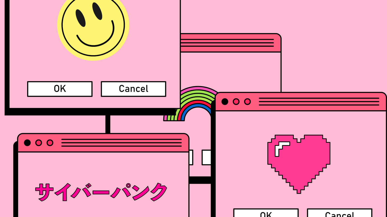
Types of Popups Based on Display Style
Display style defines how a popup feels at first glance. Some formats interrupt the flow, others blend into it. Choosing the right display style helps balance visibility and user experience. This choice often decides whether popups convert or get ignored.
Different styles work better on different pages. Landing pages favor focus, while blogs benefit from subtle prompts. Understanding these differences makes popups feel intentional, not forced.
Lightbox Popups
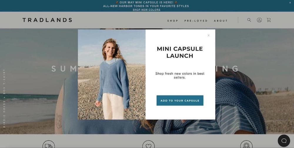
Lightbox popups appear in the center of the screen and dim the background. This format draws full attention to one message. It works well for lead generation and newsletter signups. A single form field and clear call to action keep friction low.
They popup examples often include email capture or limited offers. To avoid frustration, they should be easy to close. When paired with tools that allow popups for legitimate websites, this format stays effective and respectful.
Fullscreen Popups
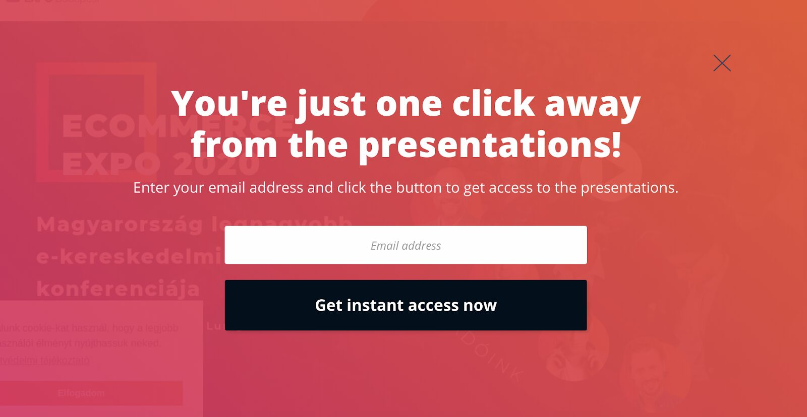
Fullscreen popups cover the entire web page. They remove distractions and guide visitors toward a single action. This style works best for major announcements, product launches, or special campaigns.
Because fullscreen popups are bold, timing matters. Showing them too early may increase bounce rate. Used wisely, they compete less with content and more with indecision. This format often stays visible even with a Chrome adblocker, when implemented correctly.
Floating Bar Popups
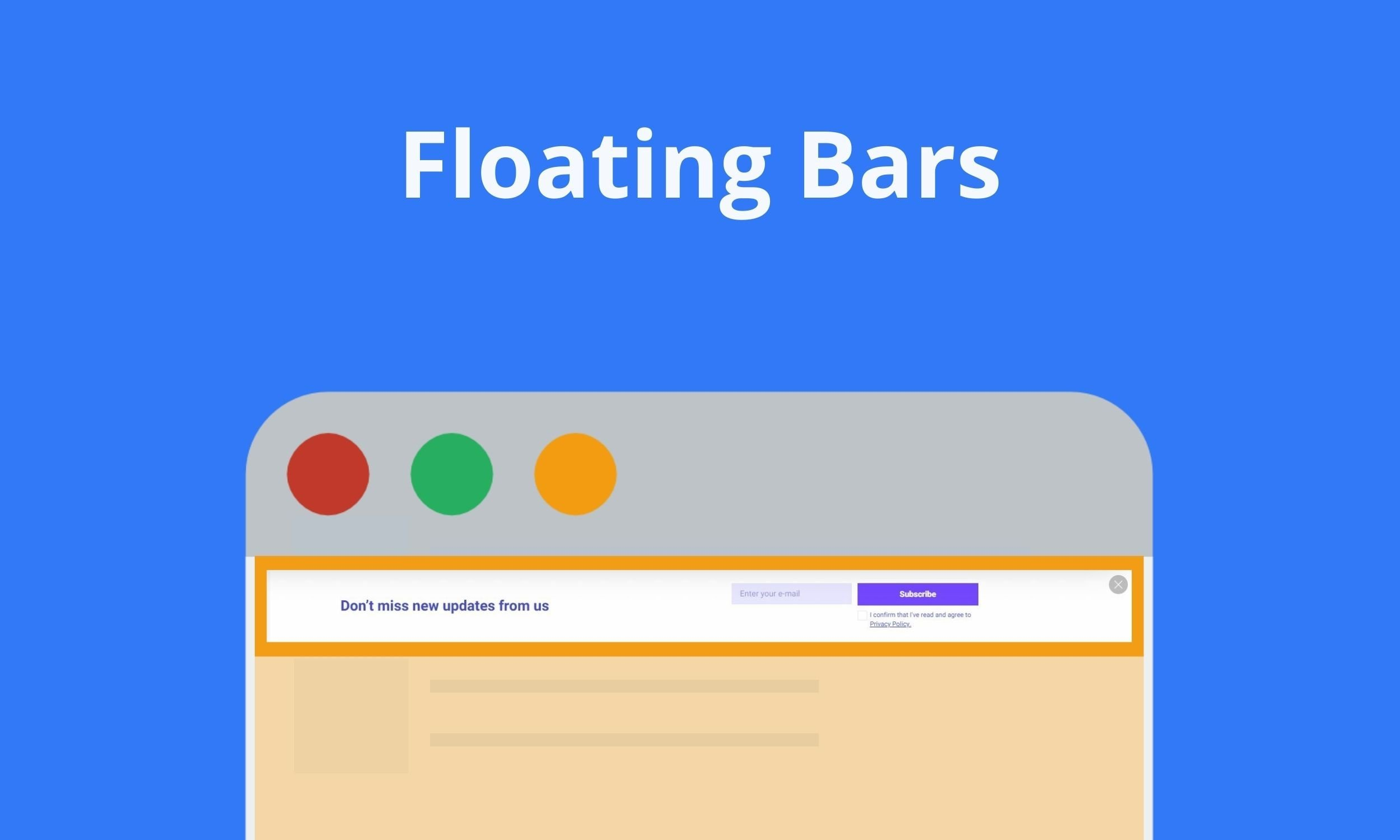
Floating bar popups stay visible while a page is being scrolled. They usually appear at the top or bottom of the screen and never block the main content. This makes them suitable for ongoing messages like discounts, announcements, or reminders that need constant visibility.
Because the content remains readable, this format feels calm and predictable. It works especially well on blogs and long-form pages, where attention builds gradually rather than instantly.
Slide-In Popups
Slide-in popups appear from the side of the screen after a specific action, such as scrolling or spending time on a page. They attract attention without stopping the reading flow, which makes them effective for blogs and content-heavy pages. This format supports soft engagement. Instead of forcing a decision, slide-ins invite interaction when interest is already present, keeping the experience natural and unobtrusive.
Yes/No Popups
Yes/No popups present a clear binary choice. One option leads to the main action, while the other allows users to decline without pressure. This structure helps reduce hesitation and speeds up decision-making. These popups work well when intent matters more than volume. Clear wording and honest choices build trust and keep interactions straightforward.
Yes/Yes Popups
Yes/Yes popups remove negative framing entirely. Both buttons confirm interest but guide users toward different paths. The focus shifts from refusal to preference. This format feels less confrontational and works well for onboarding flows or content recommendations. Visitors remain in control while still moving forward.
Multi-Step Popups
Multi-step popups break a single action into smaller stages. The first step confirms interest, while the next collects details or presents an offer. This reduces perceived effort.
By spreading interaction over steps, users feel less pressure. The process feels lighter, which improves completion rates for longer or higher-value actions.
Video Popups
Video popups use motion to communicate ideas quickly. Short clips are effective for product explanations, feature overviews, or visual storytelling. Best results come from user-initiated playback. When visitors choose to watch, engagement feels intentional and trust remains intact.
Gamified Popups
Gamified popups introduce interaction through spins, draws, or simple games. They turn conversion into a brief experience rather than a task.
This format works best for rewards and limited offers. When kept simple, gamification increases curiosity without overwhelming the visitor.
Types of Popups Based on Marketing Goals
Marketing goals define how popups should behave. Some aim to collect leads, others support sales or long-term engagement. Matching the popup format to a clear goal keeps messaging focused and results measurable.
When purpose comes first, popups feel intentional instead of decorative.
Lead Generation Popups
Lead generation popups focus on collecting contact details. They usually offer something in return, such as a guide, checklist, or early access.
Short forms perform best here. A clear value statement helps visitors understand why sharing information is worth it.
E-commerce Popups
E-commerce popups support sales-related actions. Common uses include reminders, limited offers, or recovery messages during hesitation. Timing is critical. Showing the right message before a visitor leaves can recover lost interest without feeling aggressive.
Engagement Popups
Engagement popups are created to trigger engagement rather than an immediate conversion. They direct users to related content, recommend related articles, invite comments, or showcase discussions. The emphasis remains on participation as opposed to capturing details or making a sale.
This presets particularly well for blogs, news sites and other content heavy websites. Through encouraging exploration and discovery, engagement pop-ups contribute to an extension of session duration and development of familiarity. The end goal is engagement and retention, so visitors can engage with content on their own terms.
Informational Popups
Informational popups are used to communicate updates, system notices, or policy-related messages. Their purpose is to inform clearly, not to persuade or influence behavior. Because of this, tone and structure matter more than design complexity. Clear wording and simple layout help maintain transparency and trust. When handled correctly, informational popups blend into the experience without disrupting normal browsing.
User Action Popups
User action popups respond to specific behaviors like clicks or hovers. They appear exactly when needed and disappear once the action is complete.
Because they feel reactive, these popups integrate smoothly into the user journey.
Types of Popups Based on Trigger Settings
Trigger options determine when a popup is displayed and what activity of the visitor will cause the popup to activate. Selecting an appropriate trigger makes it more relevant and less annoying. When timed correctly, popups seem contextual as opposed to interruptive. Different types of triggers are better suited for different goals, different pages on your site, and for different sources of traffic. Knowing how to use these settings helps to control frequency and align messages with intent, and to facilitate better sequence management across the company’s full website. This methodology safeguards user experience, whilst allowing campaigns to remain flexible and responsive to shift visitor patterns over time and across differing browsing contexts and utilised devices.
Exit-Intent Popups
Exit-intent popups appear when a visitor is about to leave a page. They capture attention at a critical moment. These popups work well for discounts, reminders, or last-minute value offers without interrupting active browsing and help reduce missed conversion opportunities on important pages with high exit rates or friction signals.
Scroll-Triggered Popups
Scroll-triggered popups activate after a visitor scrolls through part of a page. They rely on engagement signals and appear once interest is already established within the current content flow area.
Time-Delayed Popups
Time-delayed popups appear after a visitor spends a set amount of time on a page. This trigger avoids immediate interruption. It works well for educational content and longer reads. Delays help ensure visitors understand the context before seeing an offer. Proper timing prevents frustration and improves message relevance across varied traffic quality levels, especially on blogs, guides, and resource-focused landing pages where patience and attention develop gradually over time naturally.
Click-Activated Popups
Click-activated popups open only after a user clicks a specific element. This trigger gives full control and works well for gated content or detailed explanations requested by the visitor explicitly.
Inactivity Popups
Inactivity popups appear after a visitor stops interacting with a page. They re-engage passive users. This trigger suits reminders, guidance, or assistance messages without breaking active reading sessions and can recover attention before visitors drift away or abandon the page during longer pauses or moments of hesitation while browsing content.
Page-Based Popups
Page-based popups display only on selected pages. This trigger supports contextual messaging. Offers can match content type, funnel stage, or visitor intent. Page-level control prevents irrelevant popups and improves overall flow by aligning messages with user expectations and specific page goals across blogs, product pages, pricing sections, and support resources without increasing noise or visual clutter for returning audiences either.
Location-Based Popups
Location-based popups adjust messages using geographic data. They support regional offers, language preferences, or local compliance notices. This trigger improves relevance for global audiences. When used carefully, location targeting personalizes experiences without feeling invasive. Accuracy and transparency remain essential. Clear intent helps visitors understand why content changes based on location signals such as country, city, or regional regulations affecting displayed offers and messaging consistency across international marketing campaigns without harming trust, performance, or loading speed for diverse visitor segments worldwide.
Cookie-Based Popups
Cookie-based popups rely on stored visitor data. They control frequency and prevent repeated displays. This trigger supports better personalization and reduces annoyance during repeat visits across sessions and devices used.
First-Time Visitor Popups
First-time visitor popups greet new users with guidance or introductory offers. They set expectations and explain value early. This trigger helps onboarding and encourages exploration without overwhelming unfamiliar visitors who are still learning about the site structure and available resources during their initial browsing session on the website or platform.
Best Practices for Website Popups
Do: Time Your Popups Strategically
Strategic timing determines how popups are perceived. Showing a popup too early causes irritation. Waiting for engagement signals improves relevance. Proper timing aligns messages with user intent and increases the likelihood of positive interaction without disrupting natural navigation flow.
Do: Keep Your Message Clear and Concise
Clear messaging reduces hesitation. Visitors should understand the offer within seconds. Avoid long explanations or unnecessary details. Focus on one idea and one benefit. Simple language improves comprehension across audiences. Concise copy also supports faster decisions and prevents cognitive overload during browsing sessions on both desktop and mobile devices.
Do: Make Popups Easy to Close
Easy closure builds trust. A visible close button gives visitors control. Hidden or delayed exits create frustration. Users should never feel trapped. Clear closing options improve user experience even when visitors decline the offer. Respectful design shows confidence in the value presented. When popups are easy to dismiss, users remain open to future interactions and less likely to abandon the page entirely due to annoyance or perceived manipulation.
Do: Optimize for Mobile Devices
Mobile optimization is essential. Popups must fit small screens, load quickly, and remain readable. Poor mobile design causes frustration and immediate exits from pages on smartphones.
Do: Test Different Variations
Testing reveals what truly works. Different layouts, triggers, and messages produce different results. Regular testing helps adapt popups to changing audiences. Data-driven decisions outperform assumptions and protect long-term performance across campaigns.
Don't: Show Multiple Popups Simultaneously
Multiple popups at once overwhelm visitors. Competing messages confuse attention and reduce trust. Stacked popups disrupt navigation and increase bounce rate. One clear message performs better than several overlapping prompts. Limiting active popups improves clarity and keeps interactions manageable for visitors across all devices and browsing contexts.
Don't: Use Misleading Copy or Clickbait
Misleading copy damages credibility. Promises must match reality. Clickbait headlines create short-term clicks but long-term distrust. Visitors who feel tricked are unlikely to convert again. Honest messaging builds stronger relationships. Transparency improves engagement quality and reduces frustration. Clear expectations help users decide confidently and support sustainable conversion growth over time without harming brand perception or reputation across repeated visits.
Don't: Block Critical Website Content
Popups should never block essential content. Navigation, text, and actions must remain accessible. Obstructing core elements frustrates users and interrupts tasks. Respecting content priority keeps the experience functional and visitor-focused.
Don't: Forget About Loading Speed
Slow popups hurt performance. Heavy scripts and large assets delay page rendering. Speed affects user patience and search rankings. Lightweight design ensures fast interaction. Optimized popups load smoothly without slowing the page. Fast loading preserves engagement, reduces abandonment, and supports better overall website performance across devices, connections, and traffic sources consistently.
How to Design High-Converting Popups
High-converting popups combine clarity, timing, and relevance. Design starts with understanding visitor intent and page context. Each element should guide attention without creating friction. Clean layouts, readable text, and clear hierarchy improve focus. Popups must support the journey, not interrupt it. When design aligns with expectations, popups feel helpful and drive consistent conversions across different traffic sources.
Create Compelling Headlines
Headlines define whether a popup gets attention. Strong headlines focus on one clear benefit. They stay short, specific, and relevant to the page. Avoid vague promises. A good headline answers why the offer matters now. When value is obvious, visitors are more likely to engage without hesitation.
Use Strong Call-to-Action Buttons
Call-to-action buttons turn interest into action. Their text should describe the result, not the process. Phrases like “Get the guide” work better than generic labels. Button size and placement matter. It must stand out without overwhelming the design.
Contrast helps guide the eye, but clarity builds trust. Avoid multiple competing actions inside one popup. A single, focused CTA reduces hesitation. When paired with clear value, strong buttons improve conversions while keeping interactions natural and intuitive.
Choose the Right Colors and Imagery
Colors and imagery shape first impressions. They should support the message, not distract from it. Use brand colors to maintain consistency and recognition. High-contrast elements guide attention to key actions.
Images work best when they reinforce the offer. Avoid stock visuals that add no meaning. Simple graphics often outperform complex designs. When visuals align with copy, popups feel intentional and easier to trust.
Minimize Form Fields
Short forms convert better. Ask only for essential information. Each extra field increases friction. Fewer inputs speed decisions and make popups feel less demanding for visitors.
Add Social Proof Elements
Social proof builds credibility fast. Reviews, usage numbers, or short testimonials reassure hesitant visitors. These signals reduce risk perception and support decision-making. When popups respect user control and tools like Opera Ad Blocker, trust grows naturally. Proof works best when concise, relevant, and placed close to the call to action.
Measuring and Optimizing Popup Performance
Popup performance shows how well a message fits visitor intent. Without measurement, popups rely on assumptions. Tracking results helps improve timing, copy, and format. Optimization focuses on real behavior, not theory. Even small adjustments can improve engagement and protect user experience across different pages and traffic sources.
Key Metrics to Track
Start with metrics that reflect real value. Impressions show how often a popup appears. Click-through rate reveals interest in the message. Conversions measure completed actions like sign-ups or purchases. Bounce rate helps detect friction or poor timing. Together, these indicators explain whether a popup supports conversion goals or harms the browsing flow.
A/B Testing Your Popups
A/B testing makes popup optimization predictable. One version competes with another under identical conditions. Change only one element at a time. This may be the headline, trigger, layout, or call to action. Traffic is split evenly, so results stay reliable. Testing reveals how visitors react, not how a marketer expects them to react.
Short tests work best on high-traffic pages. Longer tests suit niche content. Focus on statistically meaningful results, not early spikes. A winning version often improves increase conversions without adding pressure. Over time, testing builds a library of insights that guide future popup campaigns and protect long-term user experience.
When to Adjust Your Popup Strategy
Strategy changes become necessary when metrics shift. Falling conversions, rising bounce rate, or reduced engagement signal problems. Context also matters. A popup that works on a product page may fail on a blog post. Seasonal traffic and audience intent influence results. Regular reviews prevent outdated popups from damaging trust and performance.
Real-World Popup Examples and Case Studies
Real-world examples show how popups perform beyond theory. Case studies highlight practical decisions behind timing, triggers, and messaging. They reveal what works across industries and traffic types, helping teams avoid mistakes, validate ideas faster, and apply proven patterns to new popup campaigns.
E-commerce Success Stories
E-commerce brands frequently rely on exit intent and cart recovery popups. Well-timed incentives reduce abandoned carts and recover lost revenue. Discounts, free shipping, or limited offers encourage visitors to stay. Successful stores avoid clutter and keep messages relevant to the product context.
Some campaigns combine popups with Stands AdBlocker to prioritize essential messages and reduce noise. This approach respects attention and improves trust. When popups appear at the right moment and match shopper intent, they feel helpful rather than disruptive. As a result, stores boost sales while preserving a smooth browsing and checkout experience for returning customers.
SaaS Lead Generation Examples
SaaS companies focus on value-driven lead generation. Popups offer demos, free trials, or guides in exchange for an email address. Simple slide-in formats often outperform fullscreen designs. Timing plays a critical role in success.
Many teams design popups that respect expectations shaped by Chrome adblocker usage. Clean layouts, clear copy, and minimal form fields reduce friction. When popups support the product narrative and appear naturally, they strengthen lead generation without interrupting exploration or damaging long-term user trust.
Content Publishers and Bloggers
Publishers depend on readability and trust. Subscription popups perform best when subtle and well timed. The goal is to block intrusive pop-ups that disrupt content flow. Lightweight newsletter prompts or delayed slide-ins respect attention. This balance keeps readers engaged, supports list growth, and protects long-term loyalty without harming organic traffic or session depth.
Common Popup Mistakes to Avoid
One of the most common popup mistakes is showing them too early. When a popup appears before visitors understand the page value, it feels intrusive and increases bounce rate. Timing should reflect engagement, not impatience. Another issue is poor targeting. Generic messages shown to everyone ignore context and reduce relevance.
Overloading popups with too much text is another frequent problem. Long copy, multiple offers, or excessive form fields slow decision-making. Visitors should understand the message within seconds. Design also plays a role. Popups that are hard to close or visually overwhelming damage trust and create frustration.
Ignoring mobile optimization is equally risky. A popup that works on desktop may break usability on smaller screens. Finally, many sites forget to limit frequency. Showing the same popup repeatedly leads to fatigue and rejection. Avoiding these mistakes helps popups feel intentional, helpful, and aligned with user expectations.
The Future of Popups: Trends to Watch
Popups are becoming more adaptive and less aggressive. The future focuses on behavior-driven logic rather than fixed rules. Instead of static timing, popups react to intent, scroll depth, and interaction patterns. This shift improves relevance and reduces disruption.
Personalization will continue to grow. Content tailored to location, device, or browsing history performs better than generic messages. Visual simplicity is another trend. Clean layouts and short copy replace cluttered designs. Accessibility is also gaining importance, ensuring popups work for all users.
Finally, ethical design will shape popup strategies. Respect for attention, clear value exchange, and user control will define which popups remain effective in the long term.
Frequently Asked Questions
Are popups bad for SEO and Google rankings?
Popups are not automatically harmful to SEO. Issues arise only when they block content, appear too aggressively, or disrupt mobile usability. When popups are easy to close, well-timed, and respectful of user experience, they do not negatively impact search rankings.
How do I create a popup without coding?
Many modern tools offer visual editors that allow popup creation through drag-and-drop interfaces. These platforms handle design, triggers, and targeting without requiring technical skills. This makes popup setup accessible for marketers and content creators alike.
What is the average conversion rate for popups?
There is no single benchmark. Conversion rates depend on traffic quality, popup type, and offer relevance. Some popups convert below two percent, while highly targeted ones can reach much higher numbers when aligned with intent.
How often should I show popups to the same visitor?
Frequency should stay low. Repeating the same popup too often causes irritation and lowers engagement. Many sites limit displays to once per session or a few times per week to maintain balance.
Can I use multiple types of popups on the same website?
Yes, but only when they serve different purposes. Using several popups at once without coordination leads to overload. Clear rules for timing and placement help keep the experience organized and readable.